MousseStruck
Brand Identity, Packaging Design, Brand Collaterals
Mumbai
MousseStruck is run by two friends/chocolate lovers. As the name itself says it all, they serve a wide range of Mousse flavours at various branches across Mumbai via Zomato, Swiggy, Food Panda, Uber Eats and other trending food apps.
Brief:
To create a brand identity, packaging and other brand collaterals for a dessert brand that must not look feminine nor masculine. The brand must also portray a little about the passionate owners - Ushra & Sahil.


Concept:
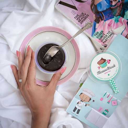
MousseStruck is a Dark Kitchen so the sale is only via online or direct call/msg. Here the idea was to tell a story through the packaging since the packaging is what will reach the consumers first hand. Hence, we created a male and a female character that represents the young, enthusiastic and passionate owners.
Both the colours mint blue as well as the pastel pink balance out the masculine and feminine aspect.
The colour mint blue is said to promote feelings of tranquillity, it helps balance emotions, it is also associated with trust and reliability.
The colour pastel pink is the colour of universal love of oneself and of others. Pink is a delicate colour that means sweet, nice, playful, cute, romantic, charming. Pink represents friendship, affection, harmony, inner peace, and approachability.
Initially, when the branding was conceptualised and designed, they were only going to start with the product line of mousse having various flavours in the long run. Their vision was to serve cookies and other bakery deserts in future. Hence, the identity has the icon of mousse in a cup with a cupid arrow that portrays the brand name "Mousse Struck".


Packaging Design for cups, three jar sizes, delivery packets
Along with the colours representing sweetness, the checkered element on the seal strip is an iconic representation of the often-used tabletop cloths in the western countries and is most associated with bakery brands.
We introduced the strip element to give it a feel of being sealed and packaged right from the manufacturing. This just brings in a trust factor towards the brand, like it has not been opened once packed. Consumers often worry when brands do not have a physical store/bakery, that where it must have come from and the quality they provide. The sealing concept was a way to build that trust.
This concept is used for the cups as well as the jars.


